PROCESS STUDY 1 — Transparency Page
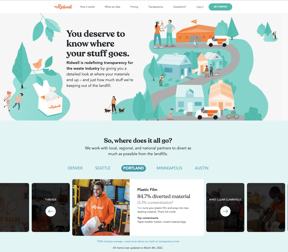
I developed content, UX, and visual design; art directed an illustrator to create the concept illustration and worked closely with engineering on implementation; and provided daily feedback in stand-ups for Ridwell’s Brand Differentiation: the Transparency landing page.
Built in six weeks. An innovative, industry-first content-driven landing page about Transparency in waste diversion, in collaboration with multiple members from cross-functional teams: Member Success, Engineering, Marketing, Product. LINK ridwell.com/transparency
View fullsize
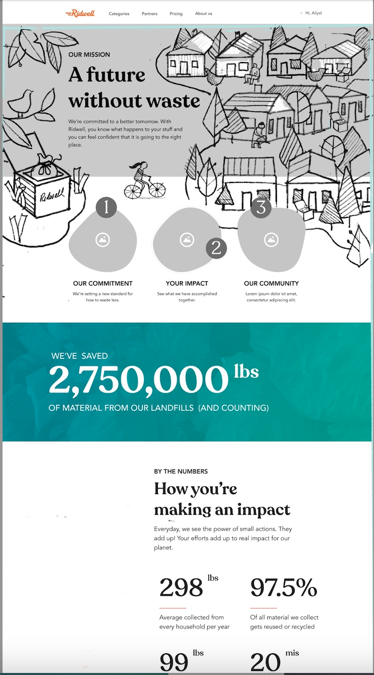
![It began as a sketch, as many good things do.]()

It began as a sketch, as many good things do.
View fullsize
![Whiteboard project vision]()

Whiteboard project vision
View fullsize
![Content V1]()

Content V1
View fullsize
![Mood Board Eco Utopian City]()

Mood Board Eco Utopian City
View fullsize
![Found illustrator who draws cities CD]()

Found illustrator who draws cities CD
View fullsize
![1.5 Wireframe with Sketch]()

1.5 Wireframe with Sketch
View fullsize
![Content Hierarchy Explore]()

Content Hierarchy Explore
View fullsize
![Content V2]()

Content V2
View fullsize
![2.0 Wireframe Data Vis]()

2.0 Wireframe Data Vis
View fullsize
![2.5 Wireframe]()

2.5 Wireframe
View fullsize
![Responsive Wrap around Image]()

Responsive Wrap around Image
View fullsize
![Impact - Personal]()

Impact - Personal
View fullsize
![Code Complete]()

Code Complete
View fullsize
![Sharing launch on social media]()

Sharing launch on social media