GAP COSMETICS
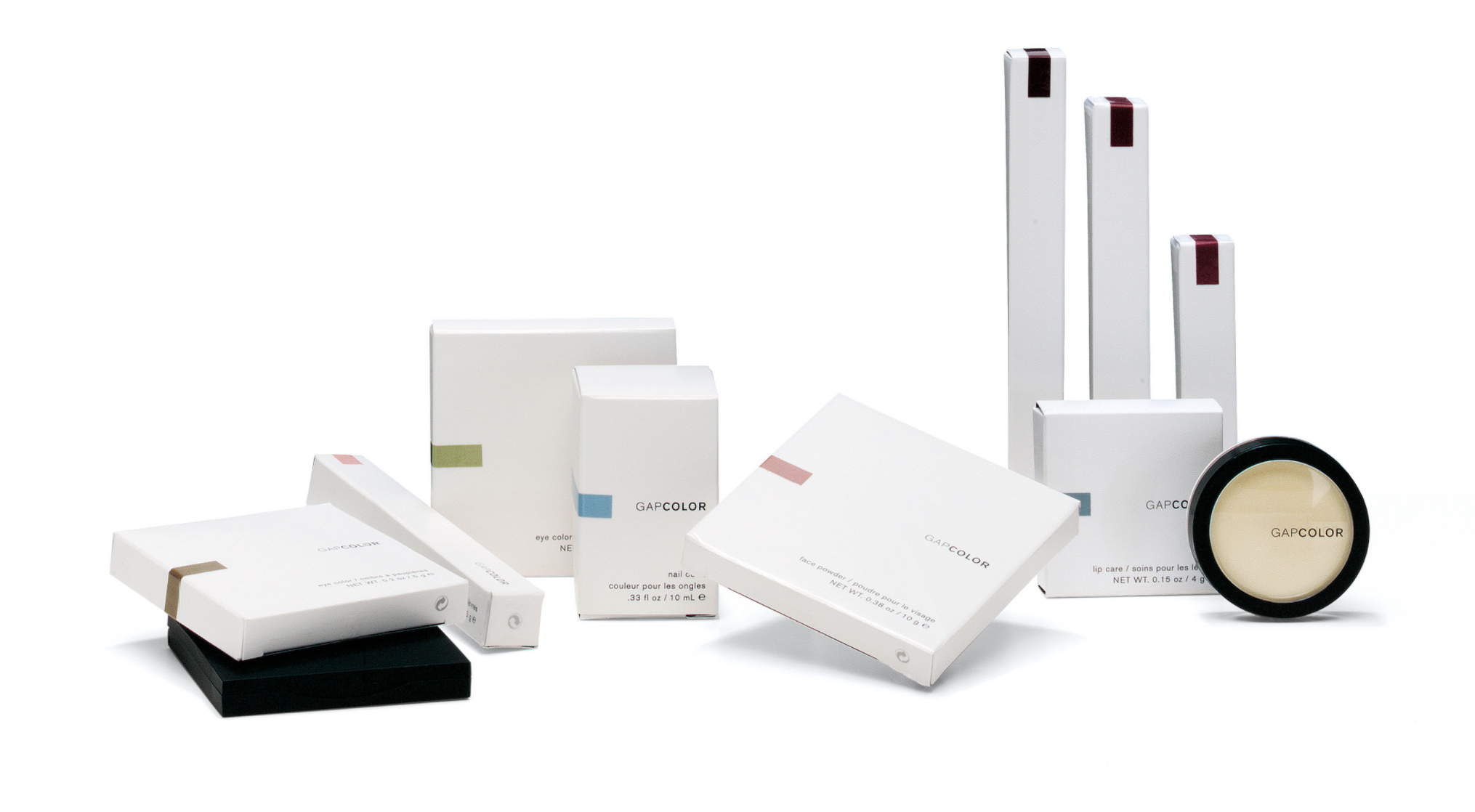
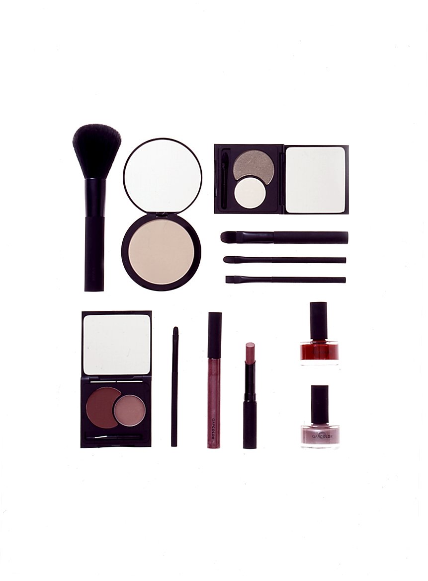
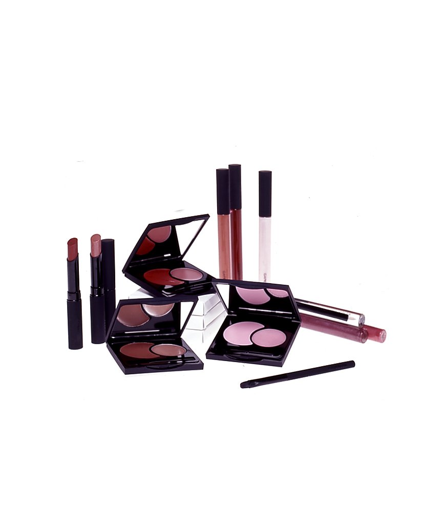
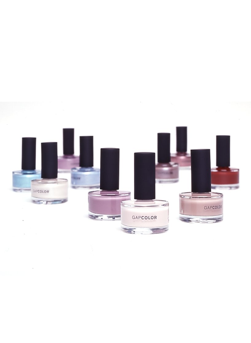
My aim for the new Gap cosmetics collection was to create a design that represents the clean, modern essence of the brand. I chose minimal white packaging to accomplish that aim, with a small color label offsetting the white space. The label gives a pop of color and indicates product color at a glance. Black soft-touch components with sleek and beautiful shapes were chosen to feel soft and cool. The dual half-moon container for eye and lip color added a sweet touch. AIGA PACKAGING AWARD